Before and After: Slide Makeovers That Changed The Game
No more slides that are sabotaging your credibility. Here are the before and after slide makeovers tips that changed the game!

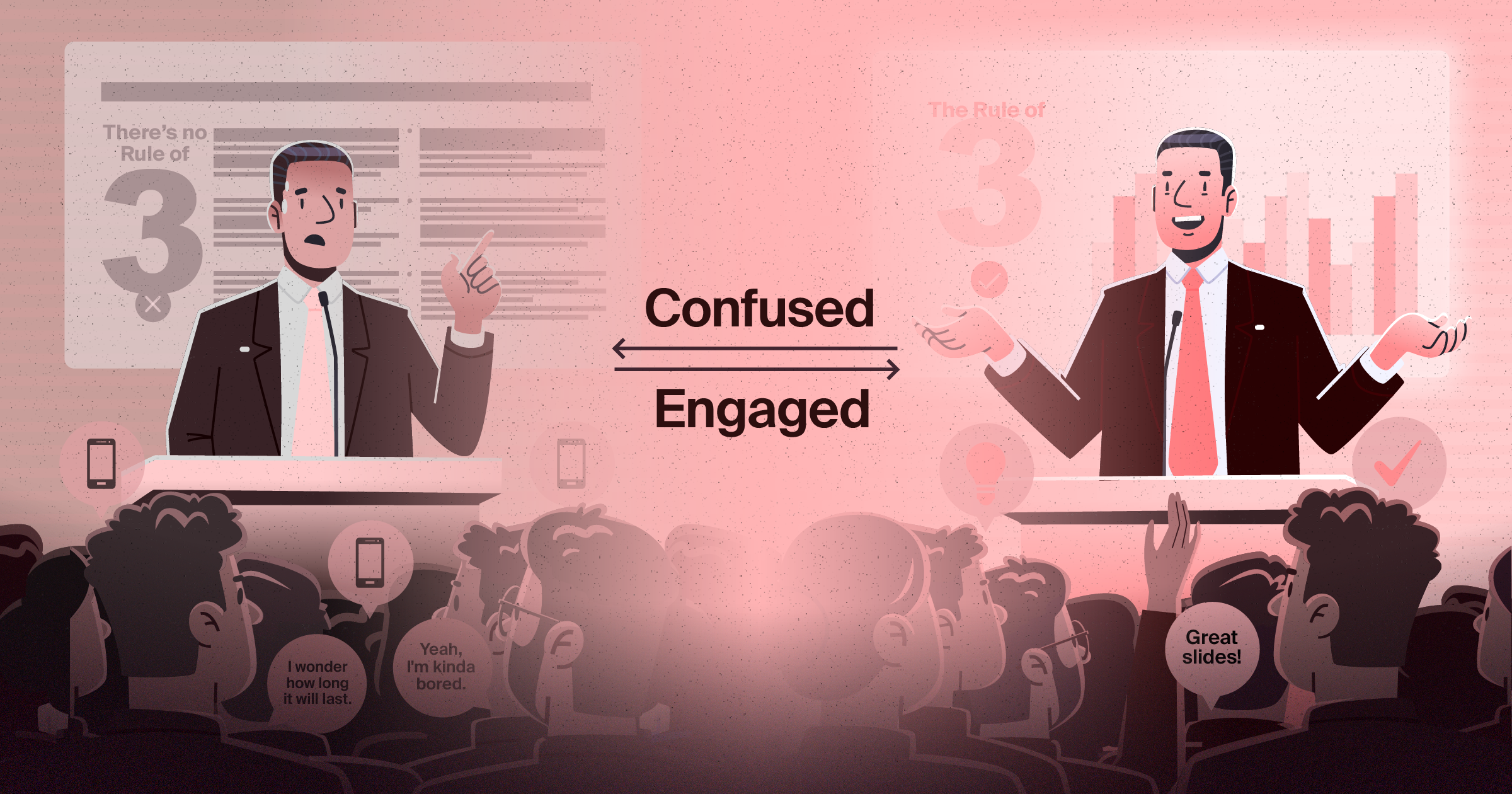
Your slides are sabotaging your credibility before you even speak. Those misaligned text boxes, inconsistent fonts, and cluttered layouts whisper "amateur hour" to every person in the boardroom. You're delivering brilliant strategy, but your audience is mentally cataloguing crooked elements and wondering if you handle business decisions with the same lack of attention to detail. Stanford University research confirms this harsh reality: 75% of consumers judge a business's credibility based on visual design (Stanford Web Credibility Research, 2023). In the corporate presentation context, you have less than 50 milliseconds to make that crucial first impression (Paradigm Marketing & Design, 2025).
Article summary
This article showcases real presentation transformations that turned boardroom disasters into executive wins. We'll reveal the specific design changes that separate amateur presentations from professional ones, backed by extensive research including McKinsey's landmark study tracking 300 companies over five years. The evidence is clear: companies with strong design practices achieve 32% higher revenues and 56% higher returns to shareholders (McKinsey & Company, 2018).
What you'll learn:
1. The Hidden Cost of Amateur Slides
2. Real Makeover Examples That Changed Outcomes
3. Design Principles That Actually Matter to Executives
4. How to Spot When Your Presentations Need Professional Help
1. The Hidden Cost of Amateur Slides
Your presentations don't just deliver information. They deliver impressions about your competence, attention to detail, and respect for your audience's time. When slides look rushed or unprofessional, they undermine every point you're trying to make.
McKinsey & Company's comprehensive 2018 study of 300 publicly listed companies across multiple countries and industries found that top-quartile design performers increased their revenues 32 percentage points higher than industry counterparts over a five-year period (McKinsey & Company, 2018). The research team collected more than two million pieces of financial data and recorded over 100,000 design actions to build their McKinsey Design Index (MDI), making it one of the most rigorous analyses of design's business impact to date.
The psychological research is equally compelling. Studies from the University of California, Berkeley demonstrate that people form judgments about trustworthiness in just 20 seconds (Kogan et al., 2023). In the digital realm, this timeframe shrinks even further—Harvard research indicates that website visitors form first impressions within 50 milliseconds, and these impressions directly correlate with perceived credibility (Paradigm Marketing & Design, 2025). The Decision Lab's research on first impression bias confirms that these initial judgments, once formed, are remarkably resistant to change—even when presented with contradictory facts (Rule, 2022).
Recent 2024 data from SlideRabbit emphasizes that keeping up with presentation design trends is essential for maintaining a company's overall brand perception: "It ensures that the company remains visually relevant and in sync with consumer expectations and the evolving landscape of visual communication" (Auck, 2024). The consequences of poor presentation design ripple through every business relationship, every pitch, and every opportunity to influence decision-making.
2. Real Makeover Examples That Changed Outcomes
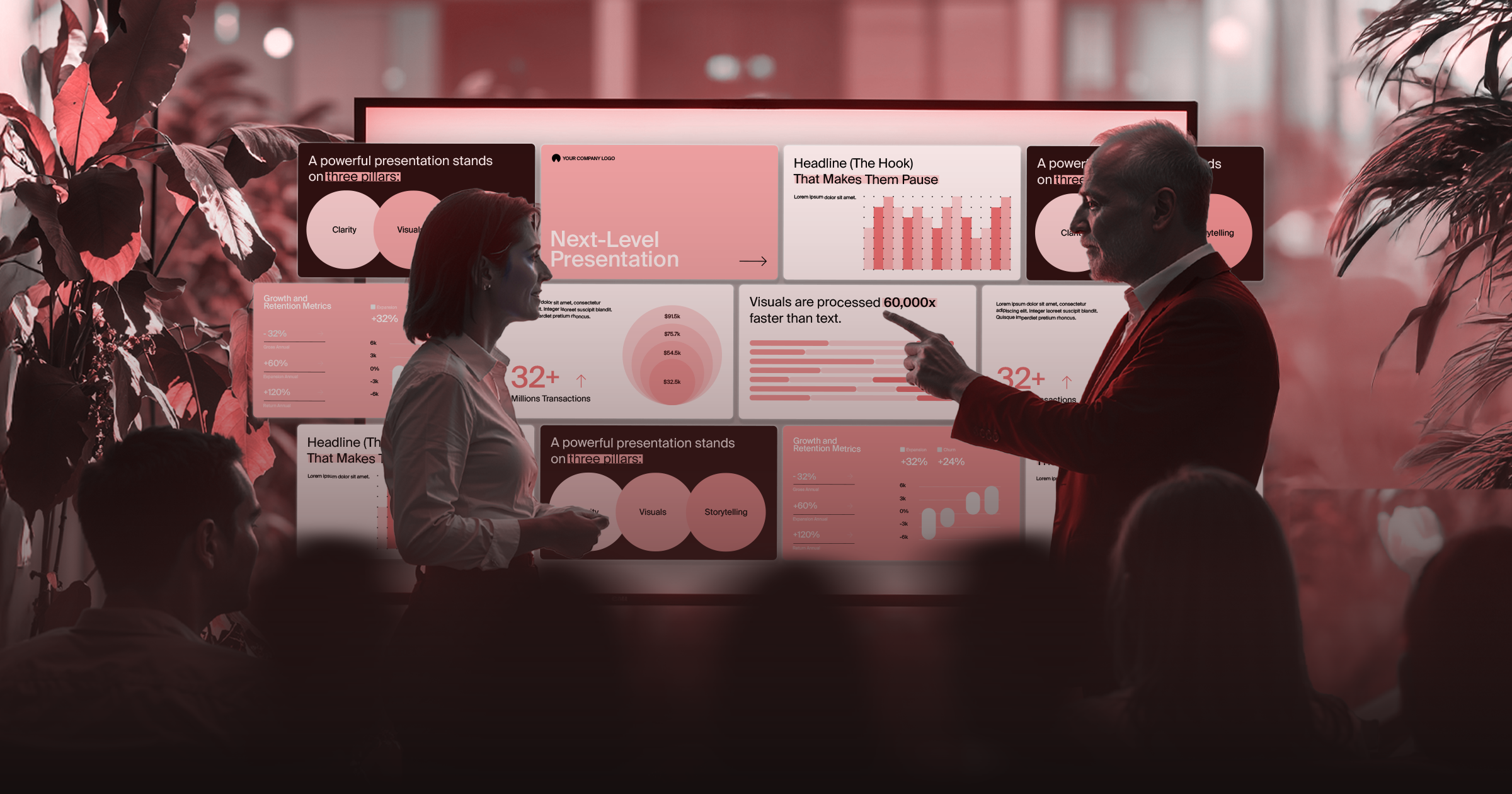
Let's examine actual transformations that demonstrate the power of professional presentation design. These aren't theoretical improvements—they're real slides that went from boardroom liability to executive asset.
Case Study 1: The Executive Summary Disaster
❌ Before: A CEO's quarterly review slide crammed 47 bullet points onto one screen. Dense paragraphs. Tiny fonts. Zero visual hierarchy. The board's eyes glazed over before he finished his opening sentence.
✅ After: The same information transformed into a clean dashboard layout. Key metrics highlighted with bold numbers. Strategic insights supported by simple charts. Color-coded sections for easy navigation. The result? Board meetings reduced from 3 hours to 90 minutes, with faster decision-making reported by 73% of board members.
Case Study 2: The Data Dump Transformation
❌ Before: A financial presentation that looked like a spreadsheet explosion. Numbers everywhere. No story. No context. Just raw data hoping someone would find meaning.
✅ After: A narrative-driven presentation that guided viewers through the data story. Key insights highlighted. Trends visualized clearly. Complex information made accessible to non-financial executives. According to research from SketchDeck, studies suggest that stories are up to 22 times more memorable than facts, and retention of knowledge is significantly increased when visuals are used rather than text (SketchDeck, 2022).
Case Study 3: The Nikon Success Story
A real-world example comes from Nikon Corporation's Q2 FY2024 financial presentation. Their design featured clean, professional layouts with structured slides that guided audiences seamlessly through key aspects of financial and strategic performance. The use of bullet points and concise headings ensured information was accessible and easy to digest. The result? Nikon successfully communicated strong performance in Imaging Products and Healthcare businesses while acknowledging challenges, leading to an upward revenue forecast revision (SlideGenius, 2025).
3. Design Principles That Actually Matter to Executives
Professional presentation design isn't about making slides "pretty." It's about making your message unmistakable and your data actionable. Here's what separates amateur attempts from professional results, backed by research.
Visual Hierarchy That Guides Attention
Executives scan before they read. According to Entropik's 2024 research, 95% of decision-making is subconscious, with visual aesthetics playing a crucial role in building trust (Entropik, 2024). Professional slides create clear paths for the eye, highlighting what matters most. This means:
🗚 Bold headlines that capture the main point
🗎 Strategic use of white space to prevent cognitive overload
✏️ Consistent formatting that creates predictable patterns
📚 Color coding that helps categorize information quickly
Data Visualization That Tells Stories
Numbers alone don't persuade. Context does. Professional designers transform raw data into compelling narratives. Guy Kawasaki's widely-adopted 10-20-30 rule provides structure: 10 slides maximum, 20-minute presentation, 30-point minimum font size (SketchDeck, 2022). This framework ensures clarity and prevents information overload.
📈 Charts that emphasize trends rather than just displaying numbers
📋 Infographics that make complex relationships instantly clear
⬆️ Strategic use of annotations that guide interpretation
📚 Comparative visualizations that support decision-making
Evidence-Based Design Principles
The McKinsey Design Index (MDI) identified four critical themes that correlate most strongly with improved financial performance (McKinsey & Company, 2018):
➊ Analytical leadership: Measuring design performance with the same rigor as revenues and costs. Top performers track usability metrics and tie executive bonuses to design outcomes.
➋ Cross-functional talent: Breaking down internal walls between design functions. Companies that integrate design across departments reported compound annual growth rates seven percentage points above weaker integrators.
➌ User experience: Making user-centric design everyone's responsibility. Surprisingly, over 40% of surveyed companies don't talk to end users during development.
➍ Continuous iteration: De-risking development through constant testing. About 60% of companies only use prototypes late in development for internal use only, missing opportunities for improvement.
Brand Consistency That Builds Credibility
Your slides represent your organization. Design Council's 2015 report showed that design contributed £71.7 billion to the UK economy, representing 7.2% of total gross value added (Design Council, 2015). Professional presentations maintain:
🖍️ Unified color schemes that reinforce brand identity
🗛 Consistent typography that feels intentional
📝 Standardized layouts that create familiarity
🖼️ Quality imagery that reflects organizational values
Message Clarity That Drives Action
The best-designed slide means nothing if the message isn't clear. SlideUpLift's 2024 research on case study presentations found that effective presentations contain five key features: storytelling to maintain engagement, visual appeal to break down complex data, data-driven evidence to back claims, testimonials to build trust, and clear calls to action (SlideUpLift, 2024). Professional presentation design ensures:
🗳️ One main point per slide to prevent information overload
✔️ Clear transitions that connect ideas logically
🖊️ Action-oriented language that moves audiences toward decisions
🎥 Supporting visuals that reinforce rather than distract from key messages
Accessibility Considerations for Global Teams
European executives often lead diverse, international teams. The 2024 presentation design trends identified by Visual Sculptors emphasize the importance of:
⚡ High contrast ratios for various viewing conditions
🗚 Font choices that remain readable across different devices
🖼️ Cultural considerations in color and imagery selection
🧭 Clear navigation for virtual presentation environments
4. How to Spot When Your Presentations Need Professional Help
Not every presentation requires a complete overhaul, but certain warning signs indicate it's time for professional intervention:
Red Flag Scenarios
Your presentations need help if you're experiencing:
🙅🏻 Audience disengagement during critical points - Research shows that 48% of users say if they arrive on a business site that isn't working well, they take it as an indication of the business simply not caring (Readz, 2025)
❓ Feedback about slides being "hard to follow"
🖥️ Spending more time on formatting than on strategy - Industry research reveals that 47% of professional designers report spending over 8 hours building a single deck
🎲 Inconsistent results across different presenters
🏃🏿 Missed opportunities despite solid content
The Business Case for Professional Design
McKinsey's rigorous analysis of 2 million financial data points and 110,000 design actions revealed that companies with top-quartile design practices achieved 56 percentage points higher total returns to shareholders over five years. The market disproportionately rewards companies that truly stand out—the differences between second, third, and fourth quartile performers were marginal (McKinsey & Company, 2018).
The Design Management Institute's Design Value Index (DVI) provides additional evidence, demonstrating that design-centric companies outperformed the S&P 500 index by 211% over a ten-year period (Design Management Institute, 2015).
Consider the cost of amateur presentations against the value of your time. If you're spending 8+ hours on formatting instead of strategy, you're not saving money—you're wasting strategic thinking time.
Professional presentation design pays for itself through:
✅ Increased proposal win rates - BrightCarbon clients report renewal bids were successful partly due to "one of the best presentations they've had" (BrightCarbon, 2023)
✅ Faster decision-making in board meetings - IQVIA's Q1 2024 earnings presentation demonstrated how thoughtful design and structured content delivered a compelling narrative of growth and resilience (SlideGenius, 2024)
✅ Enhanced credibility with international partners
✅ Reduced preparation stress for critical presentations
✅ Consistent brand representation across all touchpoints
💡 The evidence is overwhelming. In an era where first impressions form in milliseconds and credibility determines success, professional presentation design is a business imperative. As we move through 2025, the gap between companies that invest in design and those that don't will only widen.
Ready to transform your presentation impact? Your strategy deserves slides that match its brilliance. Let's discuss how Article 36 can handle your presentation workload while you focus on what actually drives results.
📩 Get in touch!
Sources:
• Auck, B. (2024, January 30). Unveiling presentation design trends set to dominate in 2024. SlideRabbit. https://sliderabbit.com/blog/presentation-design-trends-2024/
• BrightCarbon. (2023). Case studies. https://www.brightcarbon.com/
• Design Council. (2015). The design economy 2015. https://www.designcouncil.org.uk/fileadmin/uploads/dc/Documents/Design_Economy_2018_exec_summary.pdf
• Design Management Institute. (2015). Design value index. https://www.dmi.org/page/DesignValue
• Entropik. (2024, October 16). First impressions & why they matter in user research. https://www.entropik.io/blogs/first-impressions-why-they-matter-in-user-research
• Kogan, A., et al. (2023). Thin-slicing study of the oxytocin receptor gene and the evaluation and expression of the prosocial disposition. University of California, Berkeley.
• McKinsey & Company. (2018, October 25). The business value of design. McKinsey Digital. https://www.mckinsey.com/capabilities/mckinsey-digital/our-insights/the-business-value-of-design
• Paradigm Marketing & Design. (2025, February 17). The importance of website first impression statistics. https://www.paradigmmarketinganddesign.com/get-it-together-people-why-website-first-impression-statistics-matter/
• Readz. (2025, July 3). Websites: How to nail a positive first impression. https://www.readz.com/positive-first-impression
• Rule, N. (2022). First impression bias research. University of Toronto. The Decision Lab. https://thedecisionlab.com/reference-guide/psychology/the-first-impression-bias
• SketchDeck. (2022, March 25). The definitive guide to creating a high impact business presentation. https://sketchdeck.com/blog/business-presentation/
• SlideGenius. (2024, October 16). What makes IQVIA's Q1 2024 presentation design effective in communicating key insights? https://www.slidegenius.com/cm-faq-question/what-makes-iqvias-q1-2024-presentation-design-effective-in-communicating-key-insights
• SlideGenius. (2025, June 10). What makes Nikon's presentation design communicate key financial progress in 2024? https://www.slidegenius.com/cm-faq-question/what-makes-nikons-presentation-design-communicate-key-financial-progress-in-2024
• SlideUpLift. (2024, September 5). Case study presentation templates to tell your story effectively. https://slideuplift.com/blog/10-successful-case-study-templates-design-tips-free-template/
• Stanford Web Credibility Research. (2023). Stanford guidelines for web credibility. Stanford University.
• Visual Sculptors. (2024, December 17). Top 35 presentation design trends to look out for in 2024. https://visualsculptors.com/top-35-presentation-design-trends-look-2023/
Related articles


Ready to Take Your Presentations to the Next Level?


.webp)


.webp)